
· 9 min read
Adrian Brudaru

In a recent article, Anna Geller, product manager at Kestra, highlighted why data ingestion will never be solved. In her article, she described the many obstacles around data ingestion, and detailed how various companies and open-source tools approached this problem.

I’m Adrian, data builder. Before starting dlthub, I was building data warehouses and teams for startups and corporations. Since I was such a power-builder, I have been looking for many years into how this space could be solved.

The conviction on which we started dlt is that, to solve the data ingestion problem, we need to identify the motivated problem solver and turbo charge them with the right tooling.

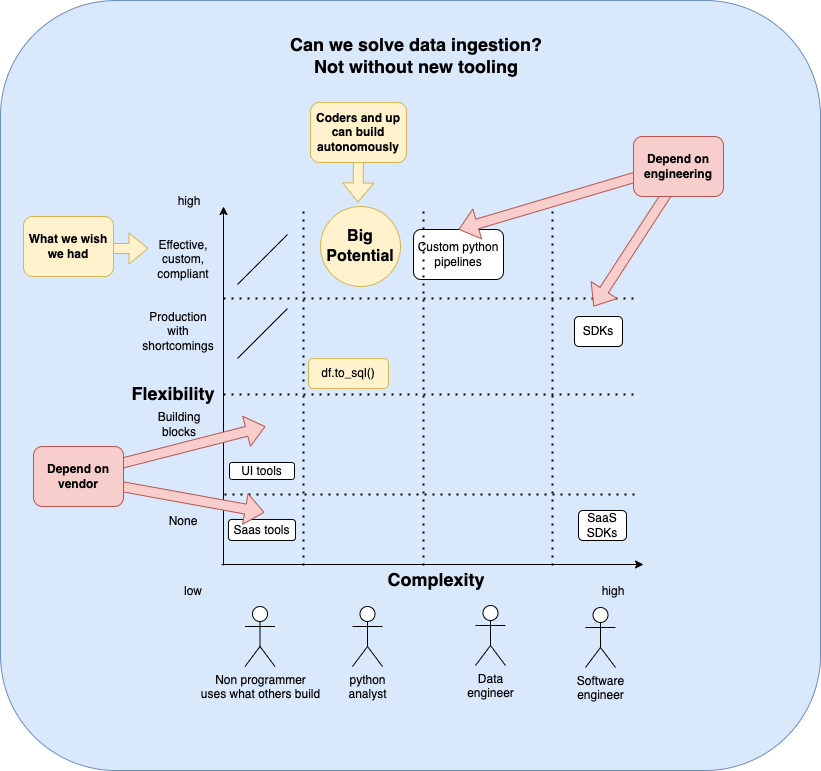
The current state of data ingestion: dependent on vendors or engineers.

When building a data pipeline, we can start from scratch, or we can look for existing solutions.

How can we build an ingestion pipeline?

  • SaaS tools: We could use ready-made pipelines or use building blocks to configure a new API call.
  • SDKs: We could ask a software developer to build a Singer or Airbyte source. Or we could learn object-oriented programming and the SDKs and become the software developer - but the latter is an unreasonable pathway for most.
  • Custom pipelines: We could ask a data engineer to build custom pipelines. Unfortunately, everyone is building from scratch, so we usually end up reinventing the flat tire. Pipelines often break and have a high maintenance effort, bottlenecking the amount that can be built and maintained per data engineer.

Besides the persona-tool fit, in the current tooling, there is a major trade-off between complexity. For example, SaaS tools or SaaS SDKs offer “building blocks” and leave little room for customizations. On the other hand, custom pipelines enable one to do anything they could want but come with a high burden of code, complexity, and maintenance. And classic SDKs are simply too difficult for the majority of data people.

etl_by_others.png

So how can we solve ingestion?

Ask first, who should solve ingestion. Afterwards, we can look into the right tools.

The builder persona should be invested in solving the problem, not into preserving it.

UI first? We already established that people dependent on a UI with building blocks are non-builders - they use what exists. They are part of the demand, not part of the solution.

SDK first? Further, having a community of software engineers for which the only reason to maintain pipelines is financial incentives also doesn’t work. For example, Singer has a large community of agencies that will help - for a price. But the open-source sources are not maintained, PRs are not accepted, etc. It’s just another indirect vendor community for whom the problem is desired.

The reasonable approach is to offer something to a person who wants to use the data but also has some capability to do something about it, and willingness to make an effort. So the problem has to be solved in code, and it logically follows that if we want the data person to use this without friction, it has to be Python.

So the existing tools are a dead end: What do custom pipeline builders do?

Unfortunately, the industry has very little standardization, but we can note some patterns.

df.to_sql() was a great first step

For the Python-first users, pandas df.to_sql() automated loading dataframes to SQL without having to worry about database-specific commands or APIs.

Unfortunately, this way of loading is limited and not very robust. There is no support for merge/upsert loading or for advanced configuration like performance hints. The automatic typing might sometimes also lead to issues over time with incremental loading.

Additionally, putting the data into a dataframe means loading it into memory, leading to limitations. So a data engineer considering how to create a boilerplate loading solution would not end up relying on this method because it would offer too little while taking away fine-grain control.

So while this method works well for quick and dirty work, it doesn’t work so well in production. And for a data engineer, this method adds little while taking away a lot. The good news: we can all use it; The bad news: it’s not engineering-ready.

Inserting JSON directly is a common antipattern. However, many developers use it because it solves a real problem.

Inserting JSON “as is” is a common antipattern in data loading. We do it because it’s a quick fix for compatibility issues between untyped semi-structured data and strongly typed databases. This enables us to just feed raw data to the analyst who can sort through it and clean it and curate it, which in turn enables the data team to not get bottlenecked at the data engineer.

So, inserting JSON is not all bad. It solves some real problems, but it has some unpleasant side effects:

  • Without an explicit schema, you do not know if there are schema changes in the data.
  • Without an explicit schema, you don’t know if your JSON extract path is unique. Many applications output inconsistent types, for example, a dictionary for a single record or a list of dicts for multiple records, causing JSON path inconsistencies.
  • Without an explicit schema, data discovery and exploration are harder, requiring more effort.
  • Reading a JSON record in a database usually scans the entire record, multiplying cost or degrading performance significantly.
  • Without types, you might incorrectly guess and suffer from frequent maintenance or incorrect parsing.
  • Dashboarding tools usually cannot handle nested data - but they often have options to model tabular data.

Boilerplate code vs one-offs

Companies who have the capacity will generally create some kind of common, boilerplate methods that enable their team to re-use the same glue code. This has major advantages but also disadvantages: building something like this in-house is hard, and the result is often a major cause of frustration for the users. What we usually see implemented is a solution to a problem, but is usually immature to be a nice technology and far from being a good product that people can use.

One-offs have their advantage: they are easy to create and can generally take a shortened path to loading data. However, as soon as you have more of them, you will want to have a single point of maintenance as above.

The solution: A pipeline-building dev tool for the Python layman

Let’s let Drake recap for us:

what would drake do

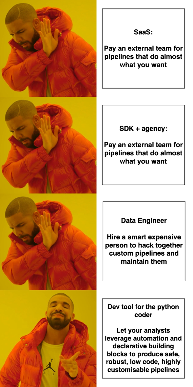
So what does our desired solution look like?

  • Usable by any Python user in any Python environment, like df.to_sql()
  • Automate difficult things: Normalize JSON into relational tables automatically. Alert schema changes or contract violations. Add robustness, scaling.
  • Keep code low: Declarative hints are better than imperative spaghetti.
  • Enable fine-grained control: Builders should be enabled to control finer aspects such as performance, cost, compliance.
  • Community: Builders should be enabled to share content that they create

We formulated our product principles and went from there.

And how far did we get?

  • dlt is usable by any Python user and has a very shallow learning curve.
  • dlt runs where Python runs: Cloud functions, notebooks, etc.
  • Automate difficult things: Dlt’s schema automations and extraction helpers do 80% of the pipeline work.
  • Keep code low: by automating a large chunk and offering declarative configuration, dlt keeps code as short as it can be.
  • Fine-grained control: Engineers with advanced requirements can easily fulfill them by using building blocks or custom code.
  • Community: We have a sharing mechanism (add a source to dlt’s sources) but it’s too complex for the target audience. There is a trade-off between the quality of code and strictness of requirements which we will continue exploring. We are also considering how LLMs can be used to assist with code quality and pipeline generation in the future.

What about automating the builder further?

LLMs are changing the world. They are particularly well-suited at language tasks. Here, a library shines over any other tool - simple code like you would write with dlt can automatically be written by GPT.

The same cannot be said for SDK code or UI tools: because they use abstractions like classes or configurations, they deviate much further from natural language, significantly increasing the complexity of using LLMs to generate for them.

LLMs aside, technology is advancing faster than our ability to build better interfaces - and a UI builder has been for years an obsolete choice. With the advent of self-documenting APIs following OpenAPI standard, there is no more need for a human to use a UI to compose building blocks - the entire code can be generated even without LLM assistance (demo of how we do it). An LLM could then possibly improve it from there. And if the APIs do not follow the standard, the building blocks of a UI builder are even less useful, while an LLM could read the docs and brute-force solutions.

So, will data ingestion ever be a fully solved problem? Yes, by you and us together.

In summary, data ingestion is a complex challenge that has seen various attempts at solutions, from SDKs to custom pipelines. The landscape is marked by trade-offs, with existing tools often lacking the perfect balance between simplicity and flexibility.

dlt, as a pipeline-building dev tool designed for Python users, aims to bridge this gap by offering an approachable, yet powerful solution. It enables users to automate complex tasks, keep their code concise, and maintain fine-grained control over their data pipelines. The community aspect is also a crucial part of the dlt vision, allowing builders to share their content and insights.

The journey toward solving data ingestion challenges is not just possible; it's promising, and it's one that data professionals together with dlt are uniquely equipped to undertake.

Resources:

· 11 min read
Zaeem Athar
info

TL;DR: In this blog post, we'll build data piplines using dlt and orchestrate them using Dagster.

dlt is an open-source Python library that allows you to declaratively load messy data sources into well-structured tables or datasets, through automatic schema inference and evolution. It simplifies building data pipelines by providing functionality to support the entire extract and load process.

It does so in a scalable way, enabling you to run it on both micro workers or in highly parallelized setups. dlt also offers robustness on extraction by providing state management for incremental extraction, drop-in requests replacement with retries, and many other helpers for common and uncommon extraction cases.

To start with dlt, you can install it using pip: pip install dlt. Afterward, import dlt in your Python script and start building your data pipeline. There's no need to start any backends or containers.

Project Overview:

In this example, we will ingest GitHub issue data from a repository and store the data in BigQuery. We will use dlt to create a data pipeline and orchestrate it using Dagster.

Initially, we will start by creating a simple data pipeline using dlt. We will then orchestrate the pipeline using Dagster. Finally, we will add more features to this pipeline by using the dlt schema evolution and Dagster asset metadata to educate the users about their data pipeline.

The project code is available on GitHub.

Project Overview

As we will be ingesting data into BigQuery we first need to create service account credentials for BigQuery. You can find more info on setting up a service account in the dlt docs.

Once we have the credentials we are ready to begin. Let’s first install Dagster and dlt. The below commands should install both.

pip install dlt
pip install dagster dagster-webserver

Simple dlt Pipeline:

As a first step, we will create the GitHub issues pipeline using dlt.

dlt init github_issues bigquery

This will generate a template for us to create a new pipeline. Under .dlt/secrets.toml add the service account credentials for BigQuery. Then in the github_issues.py delete the generated code and add the following:

@dlt.resource(write_disposition="append")
def github_issues_resource(api_secret_key=dlt.secrets.value):
owner = 'dlt-hub'
repo = 'dlt'
url = f"https://api.github.com/repos/{owner}/{repo}/issues"
headers = {"Accept": "application/vnd.github.raw+json"}

while url:
response = requests.get(url, headers=headers)
response.raise_for_status() # raise exception if invalid response
issues = response.json()
yield issues

if 'link' in response.headers:
if 'rel="next"' not in response.headers['link']:
break

url = response.links['next']['url'] # fetch next page of stargazers
else:
break
time.sleep(2) # sleep for 2 seconds to respect rate limits

if __name__ == "__main__":
# configure the pipeline with your destination details
pipeline = dlt.pipeline(
pipeline_name='github_issues', destination='bigquery', dataset_name='github_issues_data'
)

# run the pipeline with your parameters
load_info = pipeline.run(github_issues_resource())

#print the information on data that was loaded
print(load_info)

The above code creates a simple github_issues pipeline that gets the issues data from the defined repository and loads it into BigQuery. The dlt.resources yields the data while the dlt.pipeline normalizes the nested data and loads it into the defined destination. To read more about the technical details refer to the dlt docs.

To run the pipeline execute the below commands:

pip install -r requirements.txt
python github_issues.py

We now have a running pipeline and are ready to orchestrate it using Dagster.

Orchestrating using Dagster:

We will need to adjust our pipeline a bit to orchestrate it using Dagster.

Step 1: Create a Dagster project

  • Create a new directory for your Dagster project and scaffold the basic structure:
mkdir dagster_github_issues
cd dagster_github_issues
dagster project scaffold --name github-issues

This will generate the default files for Dagster that we will use as a starting point for our data pipeline.

Step 2: Set up the directory structure

  • Inside the github-issues/github_issues directory create the following folders: assets, resources, and dlt.
.
├── README.md
├── github_issues
│ ├── __init__.py
│ ├── assets
│ │ ├── __init__.py
│ ├── dlt
│ │ ├── __init__.py
│ └── resources
│ ├── __init__.py
├── github_issues_tests
│ ├── __init__.py
│ └── test_assets.py
├── pyproject.toml
├── setup.cfg
└── setup.py

Step 3: Add dlt Resources and environment variables

  • Copy the previously created github_issues_resource code into dlt/__init__.py under the dlt folder. Remove the dlt.secrets.value parameter, as we'll pass the credentials through a .env file.
  • Create a .env file in the root directory. This is the directory where the pyproject.toml file exits. Copy the credentials into the .env and follow the correct naming convention. For more info on setting up the .env file have a look at the docs.

Step 4: Add configurable resources and define the asset

  • Define a DDltResource class in resources/__init__.py as a Dagster configurable resource. This class allows you to reuse pipeline code inside an asset.
from dagster import ConfigurableResource 
import dlt

class DDltResource(ConfigurableResource):
pipeline_name: str
dataset_name: str
destination: str

def create_pipeline(self, resource_data, table_name):

# configure the pipeline with your destination details
pipeline = dlt.pipeline(
pipeline_name=self.pipeline_name, destination=self.destination, dataset_name=self.dataset_name
)

# run the pipeline with your parameters
load_info = pipeline.run(dlt_resource, table_name=table_name)

return load_info
  • Define the asset, issues_pipeline, in assets/__init__.py. This asset uses the configurable resource to create a dlt pipeline and ingests data into BigQuery.
from dagster import asset, get_dagster_logger
from ..resources import DDltResource
from ..dlt import github_issues_resource

@asset
def issues_pipeline(pipeline: DDltResource):

logger = get_dagster_logger()
results = pipeline.create_pipeline(github_issues_resource, table_name='github_issues')
logger.info(results)

The defined asset (issues_pipeline) takes as input the configurable resource (DDltResource). In the asset, we use the configurable resource to create a dlt pipeline by using an instance of the configurable resource (DDltResource) to call the create_pipeline function. The dlt.resource (github_issues_resource) is passed to the create_pipeline function. The create_pipeline function normalizes the data and ingests it into BigQuery.

Step 5: Handle Schema Evolution

dlt provides the feature of schema evolution that monitors changes in the defined table schema. Suppose GitHub adds a new column or changes a datatype of a column this small change can break pipelines and transformations. The schema evolution feature works amazingly well with Dagster.

  • Add the schema evolution code to the asset to make our pipelines more resilient to changes.
from dagster import AssetExecutionContext
@asset
def issues_pipeline(context: AssetExecutionContext, pipeline: DDltResource):
...
md_content=""
for package in result.load_packages:
for table_name, table in package.schema_update.items():
for column_name, column in table["columns"].items():
md_content= f"\tTable updated: {table_name}: Column changed: {column_name}: {column['data_type']}"

# Attach the Markdown content as metadata to the asset
context.add_output_metadata(metadata={"Updates": MetadataValue.md(md_content)})

Step 6: Define Definitions

  • In the __init.py__ under the github_issues folder add the definitions:
all_assets = load_assets_from_modules([assets])
simple_pipeline = define_asset_job(name="simple_pipeline", selection= ['issues_pipeline'])

defs = Definitions(
assets=all_assets,
jobs=[simple_pipeline],
resources={
"pipeline": DDltResource(
pipeline_name = "github_issues",
dataset_name = "dagster_github_issues",
destination = "bigquery",
table_name= "github_issues"
),
}
)

Step 7: Run the Web Server and materialize the asset

  • In the root directory (github-issues) run the dagster dev command to run the web server and materialize the asset.

GitHub Asset

Step 8: View the populated Metadata and ingested data in BigQuery

Once the asset has been successfully materialized go to the Assets tab from the top and select the Issues_pipeline. In the Metadata you can see the Tables, Columns, and Data Types that have been updated. In this case, the changes are related to internal dlt tables.

Any subsequent changes in the GitHub issues schema can be tracked from the metadata. You can set up Slack notifications to be alerted to schema changes.

Meatadata loaded in Asset

Let's finally have a look in BigQuery to view the ingested data.

Data Loaded in Bigquery

The github_issues is the parent table that contains the data from the root level of the JSON returned by the GitHub API. The subsequent table github_issues_assignees is a child table that was nested in the original JSON. dlt normalizes nested data by populating them in separate tables and creates relationships between the tables. To learn more about how dlt created these relationships refer to the docs.

Orchestrating verified dlt source using Dagster:

dlt provides a list of verified sources that can be initialized to fast-track the pipeline-building process. You can find a list of sources provided in the dlt docs.

One of the main strengths of dlt lies in its ability to extract, normalize, and ingest unstructured and semi-structured data from various sources. One of the most commonly used verified source is MongoDB. Let’s quickly look at how we can orchestrate MongoDB source using Dagster.

Step 1: Setting up a Dagster project

  • Start by creating a new Dagster project scaffold:
dagster project scaffold --name mongodb-dlt
  • Follow the steps mentioned earlier and create an assets, and resources directory under mongodb-dlt/mongodb_dlt.
  • Initialize a dlt MongoDB pipeline in the same directory:
dlt init mongodb bigquery

This will create a template with all the necessary logic implemented for extracting data from MongoDB. After running the command your directory structure should be as follows:

.
├── README.md
├── mongodb_dlt
│ ├── __init__.py
│ ├── assets
│ │ ├── __init__.py
│ │ └── assets.py
│ ├── mongodb
│ │ ├── README.md
│ │ ├── __init__.py
│ │ └── helpers.py
│ ├── mongodb_pipeline.py
│ ├── requirements.txt
│ └── resources
│ ├── __init__.py
├── mongodb_dlt_tests
│ ├── __init__.py
│ └── test_assets.py
├── pyproject.toml
├── setup.cfg
└── setup.py

Step 2: Configuring MongoDB Atlas and Credentials

For this example, we are using MongoDB Atlas. Set up the account for MongoDB Atlas and use the test Movie Flix Dataset. You can find detailed information on setting up the credentials in the MongoDB verified sources documentation.

Next, create a .env file and add the BigQuery and MongoDB credentials to the file. The .env file should reside in the root directory.

Step 3: Adding the DDltResource

Create a DltResouce under the resources directory. Add the following code to the __init__.py:

from dagster import ConfigurableResource 

import dlt

class DDltResource(ConfigurableResource):
pipeline_name: str
dataset_name: str
destination: str

def load_collection(self, resource_data, database):

# configure the pipeline with your destination details
pipeline = dlt.pipeline(
pipeline_name=f"{database}_{self.pipeline_name}", destination=self.destination, dataset_name=f"{self.dataset_name}_{database}"
)

load_info = pipeline.run(resource_data, write_disposition="replace")

return load_info

Step 4: Defining an Asset Factory

The structure of data in MongoDB is such that under each database you will find multiple collections. When writing a data pipeline it is important to separate the data loading for each collection.

Dagster provides the feature of @multi_asset declaration that will allow us to convert each collection under a database into a separate asset. This will make our pipeline easy to debug in case of failure and the collections independent of each other.

In the mongodb_pipeline.py file, locate the load_select_collection_hint_db function. We will use this function to create the asset factory.

In the __init__.py file under the assets directory, define the dlt_asset_factory:

from ..mongodb import mongodb
from ..resources import DDltResource

import dlt
import os

URL = os.getenv('SOURCES__MONGODB__CONNECTION__URL')

DATABASE_COLLECTIONS = {
"sample_mflix": [
"comments",
"embedded_movies",
],
}

def dlt_asset_factory(collection_list):
multi_assets = []

for db, collection_name in collection_list.items():
@multi_asset(
name=db,
group_name=db,
outs={
stream: AssetOut(key_prefix=[f'raw_{db}'])
for stream in collection_name}

)
def collections_asset(context: OpExecutionContext, pipeline: DDltResource):

# Getting Data From MongoDB
data = mongodb(URL, db).with_resources(*collection_name)

logger = get_dagster_logger()
results = pipeline.load_collection(data, db)
logger.info(results)

return tuple([None for _ in context.selected_output_names])

multi_assets.append(collections_asset)

return multi_assets


dlt_assets = dlt_asset_factory(DATABASE_COLLECTIONS)

Step 5: Definitions and Running the Web Server

Add the definitions in the __init__.py in the root directory:

from dagster import Definitions

from .assets import dlt_assets
from .resources import DDltResource

defs = Definitions(
assets=dlt_assets,
resources={
"pipeline": DDltResource(
pipeline_name = "mongo",
dataset_name = "dagster_mongo",
destination = "bigquery"
),
}
)

We can run the dagster dev command to start the web server. We can see that each collection is converted into a separate asset by Dagster. We can materialize our assets to ingest the data into BigQuery.

Asset Factory

The resulting data in BigQuery:

Data Ingestion in BigQuery from MongoDB

Conclusion:

In this demo, we looked at how to orchestrate dlt pipelines using Dagster. We started off by creating a simple dlt pipeline and then converted the pipeline into an asset and resource before orchestrating.

We also looked at how we can orchestrate dlt MongoDB verified sources using Dagster. We utilized the Dagster @multi_asset feature to create a dlt_asset_factory which converts each collection under a database to a separate asset allowing us to create more robust data pipelines.

Both dlt and Dagster can be easily run on local machines. By combining the two we can build data pipelines at great speed and rigorously test them before shipping to production.

· 25 min read
Hiba Jamal

cover DeepAI Image with prompt: People stuck with tables.

What’s in this article:

  1. Depending on your role, data modelling can mean different things
  2. Introducing the three dashboarding tools
  3. Introducing our database
  4. Comparison Metrics & Table
  5. In depth comparison

Depending on your role, data modelling can mean different things.

For Data & Analytics Engineers

For some of us who have spent our fair share of time working with databases, the words data model illustrates a bunch of tables on a canvas. Behind those tables we see discussions of whether or not they should be floating there by themselves or tied together by lines that say 1 or * on the corners.

If you are a data engineer, maybe you do a data vault model for ingestion, while if you are an analytics engineer you might do a dimensional model for supporting reporting requirements.

After figuring out what sort of entities, constraints and relationships we need to define, we dive further into the data types of each of the fields within those entities. This makes the recipe for a good data model. This model is then implemented in the database, and deployed to be run against new data coming in. Lastly, to avoid the ill-fated incident of an analyst being lost in the complex structure and pipeline of the data, it must be documented!

For Data Analysts

For the dashboard creators, the initial data model has (hopefully) already been set up. A subset of the tables visualized by the engineers are to be handpicked and dropped onto a dashboard. Some tools do you the favor of detecting relationships between tables, if not, you can find a way to do it on the dashboarding tool itself. The data modelling for analysts includes building aggregated measures, calculated columns, semantic types definition to define the actions the tool allows on the field, and finding the best read, cache and refresh options for the data.

If you have big data, the connected dashboards might be slow and need optimization. This is when you would be pushed to make the decision to fix the problem either before or after it reaches the dashboard. This means creating aggregated tables with a different data granularity, either in the source db or in the tool cache db.

Introducing the three dashboarding tools

The three data reporting or dashboarding tools we’ll be diving into are Power BI, GoodData and Metabase. All three have a substantial following among business intelligence teams and analytics experts, and the tools come with their own set of data modelling capabilities.

Introducing Power BI

Power BI is a powerful data visualization tool trusted by 97% of Fortune 500 companies by 2021. It's available as both desktop and online versions, but being a Microsoft product, it's limited to Windows. You can connect it to various data sources, including files like CSV and JSON, and databases like BigQuery and AWS Athena, and about 40 others! It offers a variety of visual elements for creating reports, and it also supports Python and R integration.

While its primary purpose is generating actionable reports for businesses, it's user-friendly for data exploration and modeling. It's affordable for BI analysts, with pricing ranging from free to $10-$20 per user per month, or premium bundles from $262.80 to $4,995 per month.

Introducing GoodData

GoodData prides itself as the #1 embedded analytics vendor, and currently in 2023, has 3.2 million end users worldwide. Established in 2008, it started with data exploration and visualization tools and has since evolved. In 2022, it introduced its cloud platform with enhanced features (the version referenced in this article). GoodData currently supports 10 data sources and 2 data source managers.

The user-friendly dashboard makes managing data, creating metrics, visuals, and dashboards quite clean and easy. Pricing varies based on the selected product, with both predefined and customizable options to suit an organization's needs.

Introducing Metabase

Metabase is a BI tool that is now about 4 years old, with a user base of almost 50,000 organizations that use it to work with their data. The tool has interesting terms to showcase its abilities to the “data democratization” crowd. For example, while loading visualizations or calculations, it tells you it’s: doing science ✨, which is a playful way to appeal to non-devs. Additionally, if you want to extract SQL-defined data from a source, Metabase calls it 'asking a question' to that source.

This tool serves as a foundation for embedded analytics and offers data organization through model creation and query building. With 26 official data source connectors, it also supports raw data imports. Metabase's pricing varies based on whether it's used as a managed service or self-managed. Self-management can include using it as an open-source tool, and otherwise it has pricing options that extend up to $500, along with custom pricing options.

The dataset we’ll be using for our experiments; modeled by dlt

Our database is based on the data published by LivWell, containing wellness indicators for women all around the world. It can also be found as a flattened CSV on Kaggle, here. It is a compilation of surveys collected from women internationally.

Sample input structure:

[{"survey_id": "AM2000DHS",
"country": "Armenia",
"marriage_related": [{...}, {...}, ...],
"work_related": [{...}, {...}, ...],
"education_related": [{...}, {...}, ...],
"money_related": [{...}, {...}, ...],
"health_related": [{...}, {...}, ...],
"age_related": [{...}, {...}, ...]
},
{...}, {...}, {...}, {...}]

To break it up into proper tables representing the different sections of the surveys, we gave this data to dlt to unpack it into a flat relational structure into BigQuery. dlt automatically unpacked the original data into connected tables. The various child tables link to the parent table wellness using foreign keys. Wellness contains surveys identified by ID and country. The final setup of indicators broken up into different categories can be found below, as displayed by Power BI. This structured database has been used to experiment with all three dashboarding tools in this article.

pbi-modelled-livewell 
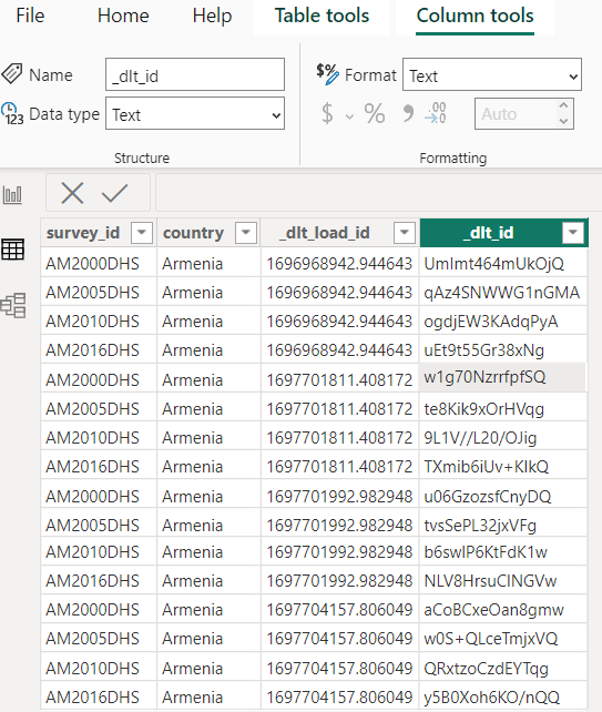
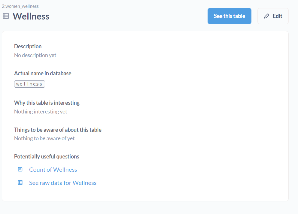
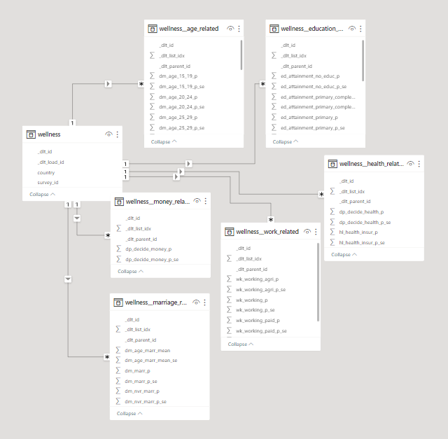
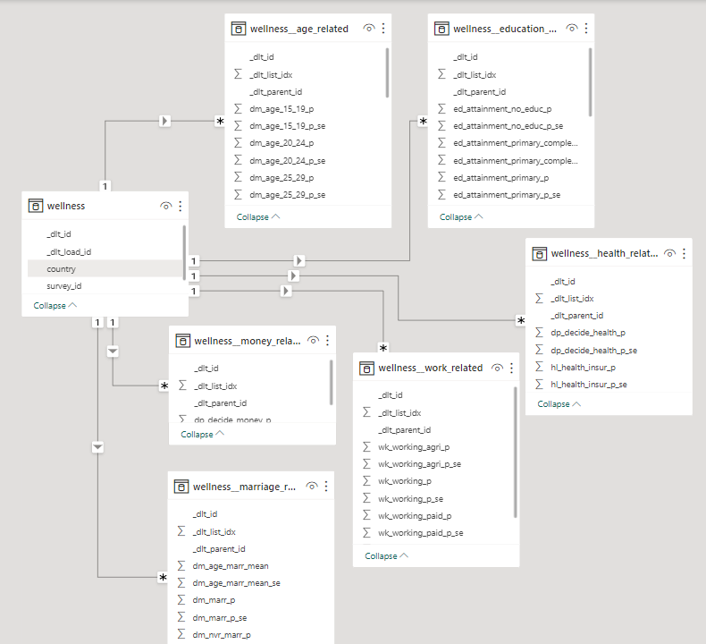
The database schema as presented by a Power BI Model.

Comparison Metrics & Table

The database hosted on BigQuery was loaded into all three dashboarding tools via their own respective connectors. We came up with some metrics to compare things.

Before delving into detailed analyses on those metrics, here's an overview of what'll be discussed:

Power BIGoodDataMetabase
Data TypesIt lets you use types like Decimals, Whole Numbers, Percentages for columns, various date and time formats, and binary objects for conditional setups.GoodData categorizes data as facts, attributes, and tables for efficient organization in a dimensional model.It uses the same data types as the source, such as integers or strings, and also adds user-friendly "field types" for better understanding.
Data DictionariesPower BI allows column property editing but lacks a built-in data dictionary view, accessible via the performance analyzer.GoodData Cloud provides a simplified data dictionary with column properties for easy fact-label categorization, including source data mappings.Metabase has a robust data dictionary in the admin panel, enabling column-level property and description configurations.
Table Properties & DescriptionsPower BI shows table descriptions right under the “Model View” tab, this can be used as a means for table level documentation.GoodData displays table descriptions in the "Data" tab, emphasizing data source mapping over table-level documentation.Metabase provides descriptions through the "Learn about this table" feature, offering insights on the table's significance and important details.
Inter Table Relationships Simplifies data modeling in Model View with drag-and-drop relationships, auto or manual detection, and cardinality editing.GoodData separates date fields into distinct tables, creating a star schema, automatically identifies keys using source naming conventions, and allows drag-and-drop relationships creation.Metabase lets you specify keys at the table level, globally in the admin panel, or within Models and questions, connecting tables through SQL queries or models.
Custom Query language Power BI developers use DAX for measures and fields and Power Query M for data import and transformation.GoodData uses MAQL, a unique query language for multi-dimensional models, unlike traditional SQL for relational databases.Metabase uses SQL for custom models and expressions, seamlessly integrating code with visualizations.
Data granularity Management: Column Creation & Aggregation capabilities Power BI permits the creation of custom fields, and tables, facilitating data granularity adjustments and customized aggregation.Custom calculated fields and other transformations can be achieved with a SQL query under the dataset. Datetime granularity is simplified with custom truncation settings.Like Power BI, it allows users to create models with custom aggregation levels and add custom fields through Custom Expressions.
Defining Local or Central Metrics Power BI Measures can be made in various ways, with DAX for reusable aggregations and has a central "Metrics Hub" in the Power BI service.GoodData uses MAQL for custom metric creation, easily added in the "Analyze" tab. Reusable/central metrics are managed in the Metrics tab.Custom metrics can be crafted through SQL, Questions, Models, and admin-defined metrics can be used in reports with suitable access.
Data Refresh and Loading capabilitiesPower BI data updates vary by loading method: Imported data uses refresh options, while DirectQuery/LiveConnect relies on cache.GoodData has a refresh button for updating source data, with a focus on cache refresh. An automated notification process helps clear old cache data and load the new.Metabase automatically updates data. You can import files for ad hoc analysis and connect dashboards to hosted databases for regular syncing. It has caching abilities too.

In-Depth Comparison

1. Data Types

When designing databases, or even coding in languages that require the “type” of a variable to be declared, we think of data types like int, float, double, char, varchar, string etc. The story becomes slightly different within dashboarding tools.

hard coded dashboard

Power BI

The column types as declared in Power BI in the first image here show that instead of saying double or int, it says Decimal and Whole number. We also have options for visualisation formats such as percentage or different datetime notations. It also has a binary type which is supported in the editor to enable conversion to friendlier types for the end user.

hard coded dashboard

GoodData

While there is a wide range of data types supported in the GoodData pipeline, they are mostly semantic, so relating to their usage not form. It takes all numeric type columns and sets them as facts, the date type columns and creates another table from them, and all text or character based columns and sets them as attributes. This also helps the tool in splitting the columns up into tables in a dimensional model - which will be discussed further in the inter-table relationships section.

hard coded dashboard

Metabase

Interestingly, in Metabase, the data type is defined as it exists in the source, like an integer or string. But, the “field type” isn’t that straightforward; these are not int, float, varchar, or even percentage that we are used to when declaring dashboard columns, but types that are recognizable to any user. These are semantic types, rather than data types. For example, if a column contains numeric data, the categories available to select are Quantity, Price, Cost, Score, etc.

2. Data Dictionaries

In order for an end user to use data, they need to have data literacy. That is the ability to understand what the data they look at actually represents. To enable that, having a data dictionary is a first step. This includes column definitions and the ability to manipulate them, which can be a basic requirement for any dashboard creator.

hard coded dashboard

Power BI

It allows users to edit column level properties on both its main dashboard and on the “Transform Data” window that shows up on the “Model View” tab. This allows you to select the data type of the column, to edit the name, format, and other sorting and aggregation functions you might want to apply to the column. However, this does not have the “data dictionary document” view that one might look for, as one has to click on each column to see its properties. In order to see the proper “data dictionary” document, it can be extracted through Power BI’s performance analyzer.

hard coded dashboard

GoodData

In GoodData Cloud, they increase the level of simplicity to read a data dictionary, and it has only a subset of options presented in the other two tools. The column level properties entail converting the field to a fact or label, or moving the field to another table. It is the only tool here that shows the actual column name and mapping for each column in the logical model as it maps to the data source. This helps us understand which fact and label is matched to which database field in the source data, and how it was perceived under the naming convention in the source. This convention will be discussed more under table relationships.

hard coded dashboard

Metabase

Metabase allows users to view the data dictionary for all tables in the admin panel. This includes setting column properties as well as field settings to be adopted into analytics flows. There are also other aspects to view and change column properties. The first is that after using the little book icon that says “Learn about this table”, we are taken to some documentation that would be available on what that table is (if it was filled in before). After which, we can click on the “Fields in this table” category and that is where the field type of columns can be updated. The second place one we can change the field type is in the meta data of “Questions” or “Models” created. These can be excerpts of data with particular elements of different tables in the selected database. Lastly, Metabase is also the only tool among all, that has the ability to add column level descriptions - that is an amazing level of documentation that one can have available.

3. Table Properties & Descriptions

For an analyst, navigating extensive databases within dashboards can be a challenging endeavor. Ideally, one should be able to discern the purpose of each table by its name alone. While this might be feasible for analysts who were involved in creating and configuring the database, it can be quite perplexing for newcomers to the organization. In such cases, comprehensive documentation becomes an invaluable resource, aiding them in their data exploration journey.

hard coded dashboard

Power BI

All tools show table level descriptions in some shape or form. Power BI shows table descriptions right under the “Model View” tab, this can be used as a means for table level documentation.

hard coded dashboard

GoodData

GoodData on the other hand shows it in the “Data” tab, under “More” > “View” details option on each table. This does not show a documentation level of description for each table as the other two tools. But includes the data source mapping as discussed in the column details section.

hard coded dashboard

Metabase

Metabase shows descriptions and ways to add them in the “Learn about this table” option on each table name, then takes it one step further and adds more information by asking “what makes this table interesting” and “things to be aware of”.

4. Inter Table Relationships

In order to create metrics and visuals that involve data from multiple tables and/or datasets, each dashboarding tool needs to be able to detect or define relationships if they exist.

hard coded dashboard

Power BI

Power BI has one of the most popular setups for data modelling, all contained within its Model View. It has the ability to both auto-detect relationships and the functionality to define them inside the tool in a very easy, drag and drop method. The cardinality for relationships is mostly detected itself even if the relationship is defined, but can also be edited.

hard coded dashboard

GoodData

As for GoodData, the logical modelling layer is quite different than the other two. As discussed in the data types section, and shown in the image, the date type fields are taken and defined as separate tables (or datasets). The reason for doing so is in the spirit of creating a star schema; where one date table serves every table that requires a date dimension. GoodData takes into consideration the star and snowflake schemas as it splits all fields up into facts, labels and attributes. GoodData requires that fields be named according to a particular convention in the source to be recognized as keys automatically. However, it is also possible to assign primary and foreign keys by drag and drop methods.

hard coded dashboard

Metabase

For Metabase, a primary or foreign key can be stated as such in the metadata (or field type display/settings) of a table. This can be either be done globally through the admin panel, through field settings in the data dictionary as discussed above, or per visual within Models and questions, through joins. Which means that in order to create a visual out of two or more connected tables, they need to be defined in some sort of SQL Query or Model (if not already connected in the global metadata). There is no ERD level view of table relationships as defined in GoodData and PowerBI.

5. Custom Query Language

When all drag and drop methodologies for defining metrics just aren’t cutting it anymore, one craves SQL and must resort to code. However, different dashboarding tools have different custom query languages.

hard coded dashboard

Power BI

Power BI has two custom languages known to its developers. One of them is DAX - Data Analysis Expression, and the other is Power Query M - Microsoft Power Query. DAX helps to build formulas and easy-to-complex expressions for measures and fields. Power Query is a powerful import defining tool. This can include filtering through one data source while loading it, or combining multiple data sources to your own need. This sets itself apart from other custom query tools as it is helpful during data loading, as compared to metric creation for visuals.

hard coded dashboard

GoodData

GoodData has its own query language called MAQL, or Multi Dimension Analytical Query Language. It is what is used to define metrics, expressions, functions, or other simple or statistical queries. It works on top of the logical data models defined, and hence is aware of the table relationships and dimensions. That is what sets is apart from SQL, which is for relational databases, while MAQL is designed to perform for multi-dimensional models. SQL can still be used to specify a SQL dataset in scope of the logical data model. MAQL is then used on top of this stored query instead of a physical table.

hard coded dashboard

Metabase

Metabase sticks to the basics and uses everything SQL! It uses SQL to define custom models and expressions. This includes both writing code to create aggregations and metrics, and the interactive SQL form that they have created. The non-code SQL allows users to do everything one can with SQL, with very well thought-out frontend capabilities. The interwovenness of SQL can be seen when code creates visualizations, and vice versa! Meaning, the aggregations created directly on visualizations can be converted into SQL code - as shown in the image.

6. Data granularity Management: Column Creation & Aggregation capabilities

In foundational database courses, we learn the importance of normalization and how great it is to keep the integrity of your data. However, as we go deeper into normalization levels, the data may become redundant and that is a problem for dashboarding tools, because the data becomes unnecessarily heavy to load. Different tools provide different methods to overcome this problem. That can either look like reducing data granularity, creating custom fields or aggregating tables.

hard coded dashboard

Power BI

Power BI introduces the ability the create custom fields and columns where you might be able to truncate redundant data; like the granularity of time into chunks. On top of which, another table can be built, aggregated on the granularity level you require. This can go beyond chunks of time, into categorizations of any nature, which is a great level of customization that is available in Power BI; the power to make custom calculated fields in the Transform Data section of the tool.

hard coded dashboard

GoodData

GoodData allows you to switch each dataset from being mapped to a physical table to being defined by a custom SQL query. This feature enables you to add custom-calculated fields, filter out specific data, or even join multiple tables as needed. You can then map the fields to the results of that SQL query. Additionally, GoodData helps manage granularity for datetime fields directly by a setting your own custom truncation to them. This can be done so easily by viewing the details on the datetime objects that are cast as a separate table/dataset by GoodData.

hard coded dashboard

Metabase

The same methodology can be followed in Metabase. Where it is easily possible to create Models with your own defined level of aggregation, as well as custom fields that you can introduce to the tables. Custom Fields are created using Custom Expressions in Metabase - which can be done through the query builder.

7. Defining Local or Central Metrics

One of the main responsibilities of BI experts is to track metrics, align them with the company’s expectations, flag them if they go over or under their expected magnitudes. This, according to some data professionals calls for centrally defined definitions that others can use and follow, rather than defining them on their own and possibly misleading analytics flows. The ability to predefine metrics, or aggregations in a dashboard are known as the key abilities of any dashboarding tool! Alongside the ability to simply define these metrics, let’s also explore the ability the define central definitions of metrics as well.

hard coded dashboard

Power BI

In Power BI, these metrics are known as Measures, and can be created from both the fields pane and the calculations view on the Home tab. Either the options given on the Fields pane can be directly utilized to create a metric on a visual, or DAX can be used to create a reusable aggregation as another field under a table. Additionally, the power BI service has a “Metrics Hub”, where users can create metrics and set the scope for which other users can use them.

hard coded dashboard

GoodData

Involving its own query language, GoodData uses MAQL to create custom metrics that can be dragged on to the visuals in the “Analyze” tab easily. This functionality can be found under the Metrics tab, where all metrics can be created and managed. Since these metrics are saved, this can act as a central service to manage and use metrics too!

hard coded dashboard

Metabase

In Metabase, the Summarize functionality serves the same function as aggregated metrics-creation. This can be found after you click on any table in a selected database. Furthermore the functionality for creation of custom metrics can be extended to an SQL query, Metabase Question or Model. Additionally, in the Metabase admin panel, one can create centrally defined metrics as well. These can be adopted into reports that anyone can create, as long as granted the right access!

8. Data Refresh and Loading capabilities

Whether a dashboard is being built for the first time, or is fully furnished but needs to be periodically updated, data loading capabilities of dashboards must be carefully considered for successful reporting. All three tools have very clear methods to add data and support various sources including custom json and csv loaders. How the data can be manipulated after that has been discussed in depth above. We lastly talk about updates.

hard coded dashboard

Power BI

Coming to data updates and refresh capabilities, it depends on how data was loaded onto Power BI. If the data has been imported, then the refresh button and scheduled refresh would work fine to update the dashboards. However, if the loading has been through DirectQuery or LiveConnect, then it does not make sense to add an additional refresh functionality as it does not apply. What does end up being needed is cache availability. Which is provided on Premium offers of the product.

hard coded dashboard

GoodData

GoodData also has a clear refresh button and methodology to refresh sources in the tool. But, unlike Power BI, GoodData refreshes it’s cache as opposed to the entire database. The tool stores computed results and data used in visuals and dashboards in an internal cache. If data is to be refreshed, the cache needs to be refreshed. In this process, it is recommended by GoodData that an automated notification process be set up to clear up the cache from the old data, and load into the new one.

hard coded dashboard

Metabase

As established above, data need only be refreshed if it is stored. Metabase establishes a direct connection to the source, so it doesn’t need a refresh option. Unless the data is a file based import, then Metabase recommends that it be used for ad hoc analysis. As for periodic database syncing, one should rather connect their dashboards to a hosted database. To manage overly frequent refreshes and its impact on dashboards, Metabase offers a Result cache for dashboard charts and a Model cache for modelled data.

· 7 min read
Dylan Hughes & Chris Reuter

This article is reposted from Prefect.io blog, and you can read the original there.

The hardest part about writing a blog is getting started - writing the outline and filling out the first few key points. The same can be said for writing data pipelines: you need to inspect docs, determine data structures, write tests, etc.

What if you could build a resilient, production-ready data pipeline that is scheduled and running in just a few minutes? We’ll show you how to do just that with dlt and Prefect.

dlt

dlt is an open-source library that you can add to your Python scripts to load data from various and often messy data sources into well-structured, live datasets. It abstracts away the need to hunt through docs, interpret APIs, and reinvent the wheel every time. Instead of writing a custom pipeline, you can use dlt to build a framework for your pipelines for any combination of tools.

Moving Slack data into BigQuery

We use BigQuery as our data warehouse, and try to centralize as much information there as possible. Given our Slack community is over 25,000 people, it makes sense to use that information to better our community. We can identify the types of questions our users struggle with the most, and take action to improve Prefect by using Slack data.

If you Google “load Slack into BigQuery,” you’ll see a bunch of listings for no-code tools like Zapier that can help you move data… for a fee, of course. What if you want to do this yourself? Slack has an API, but check it out. It would take some effort to interpret even a simple response like this one for users:

{
"ok": true,
"members": [
{
"id": "W012A3CDE",
"team_id": "T012AB3C4",
"name": "spengler",
"deleted": false,
"color": "9f69e7",
"real_name": "spengler",
"tz": "America/Los_Angeles",
"tz_label": "Pacific Daylight Time",
"tz_offset": -25200,
"profile": {
"avatar_hash": "ge3b51ca72de",
"status_text": "Print is dead",
"status_emoji": ":books:",
"real_name": "Egon Spengler",
"display_name": "spengler",
"real_name_normalized": "Egon Spengler",
"display_name_normalized": "spengler",
"email": "spengler@ghostbusters.example.com",
"image_24": "https://.../avatar/e3b51ca72dee4ef87916ae2b9240df50.jpg",
"image_32": "https://.../avatar/e3b51ca72dee4ef87916ae2b9240df50.jpg",
"image_48": "https://.../avatar/e3b51ca72dee4ef87916ae2b9240df50.jpg",
"image_72": "https://.../avatar/e3b51ca72dee4ef87916ae2b9240df50.jpg",
"image_192": "https://.../avatar/e3b51ca72dee4ef87916ae2b9240df50.jpg",
"image_512": "https://.../avatar/e3b51ca72dee4ef87916ae2b9240df50.jpg",
"team": "T012AB3C4"
},
"is_admin": true,
"is_owner": false,
"is_primary_owner": false,
"is_restricted": false,
"is_ultra_restricted": false,
"is_bot": false,
"updated": 1502138686,
"is_app_user": false,
"has_2fa": false
}
]
}

With dlt

You can use dlt to build a Slack to BigQuery pipeline in just a few seconds with a single command. Seriously, it is that simple. In preparation, let’s make sure to install what we need:

pip install dlt
pip install prefect

Then just run a simple init command:


dlt init slack bigquery

In the .dlt/secrets.toml file, enter your Slack and BigQuery credentials:

[sources.slack]
access_token="*****"

[destinations.bigquery]
location = "US"

[destination.bigquery.credentials]
project_id = "*****"
private_key = "*****"
client_email = "*****"

With a single command + adding some credentials, we now have the framework of a pipeline! Look at what has been generated, with a couple of small customizations:

Note that we are redacting some of the code in the preview for brevity, to follow along completely navigate to the repo.

# Pipeline to load Slack into BigQuery

from typing import List

import dlt
import pendulum

from slack import slack_source

def load_channels() -> None:
"""Execute a pipeline that will load a list of all the Slack channels in the workspace to BigQuery"""
# ...

def get_resources() -> List[str]:
"""Fetch a list of available dlt resources so we can fetch them one at a time"""
# ...

def load_channel_history(channel: str, start_date: Date) -> None:
"""Execute a pipeline that will load the given Slack channel incrementally beginning at the given start date."""
# ...

def get_users() -> None:
"""Execute a pipeline that will load Slack users list."""
# ...

if __name__ == "__main__":
channels = None
start_date = pendulum.now().subtract(days=1).date()

load_channels()

resources = get_resources()
for resource in resources:
if channels is not None and resource not in channels:
continue

load_channel_history(resource, start_date=start_date)

get_users()

What if it fails?

Great, we’ve got a pipeline that moves data from Slack to BigQuery, and we didn’t have to format any JSON - that alone is a win. However, there may be some issues. What if Slack rate limits you? What if BigQuery is down (😅)? What about a networking issue? What if the execution environment where this script lives isn’t working?

These questions are the difference between a pipeline and a resilient pipeline. They’re the difference between you getting sleep at night and you looking like a hero (or a dummy) to your stakeholders.

Adding Prefect

Prefect is a workflow orchestration tool for turning your pipelines into scheduled, repeatable, and resilient workflows. With Prefect you get scheduling, observability, and automations that can make sure your pipelines aren’t causing you stress in the middle of the night.

Make sure you’re logged in to Prefect Cloud by signing up and using the following command:

prefect cloud login

Luckily, Prefect is also incredibly Pythonic. Turning any pipeline into an observable, scheduled Prefect flow is as simple as adding decorators to your functions and serving it up. Here’s our dlt generated pipeline, scheduled daily:

from typing import List

import dlt
import pendulum
from prefect import flow, task
from slack import slack_source

@task
def load_channels() -> None:
...

@task
def get_resources() -> List[str]:
...

@task
def load_channel_history(channel: str, start_date: pendulum.Date) -> None:
...

@task
def get_users() -> None:
...

@flow
def slack_pipeline(
channels=None, start_date=pendulum.now().subtract(days=1).date()
) -> None:
load_channels()

resources = get_resources()
for resource in resources:
if channels is not None and resource not in channels:
continue

load_channel_history(resource, start_date=start_date)

get_users()

if __name__ == "__main__":
slack_pipeline.serve("slack_pipeline", cron="0 0 * * *")

We’ve added @task to our individual functions. These will be treated as individual units of work by Prefect when they are executed. We decorate our primary function (slack_pipeline) with @flow, which references our task functions. We will schedule and kick off flows, which in turn will execute tasks based on the decorators within them.

Finally, adding .serve to our if __name__ == "__main__": call means that a Prefect deployment will be automatically created and scheduled to run daily at noon. We can see our deployment and scheduled runs in the Prefect UI, and we’ll know when it ran or, more importantly, if they didn't. We can further extend our pipeline by:

Where to handle failure

There are many levels of failure, you could say, from "accidentally liking your ex's social media post from five years ago" to "trying to assemble IKEA furniture without instructions," up to "asking for the Wi-Fi password at a funeral." So which ones should we handle where, and what are some quick solutions?

With dlt, your pipelines are resilient at the API level. From schema changes to network issues or memory overflow, there is automated resiliency and recovery that is specific to working with the pesky APIs of your tools.

With Prefect, your pipelines become resilient at the function level. If your workflows never run, break and fail, or break and never end, Prefect will be your backstop - notifying you and taking the appropriate action in case of failure.

Building resilient pipelines faster with dlt + Prefect

Getting into production is hard. First you need to build your pipeline, and then you need to make it resilient. With this tutorial, we’ve shown you how to quickly build pipelines with dlt and then turn that pipeline into a resilient, repeatable workflow with Prefect.

Prefect makes complex workflows simpler, not harder. Try Prefect Cloud for free for yourself, download our open source package, join our Slack community, or talk to one of our engineers to learn more.

· 12 min read
Hiba Jamal

What’s in this article:

  1. ⌛The Problem; The bulk of time spent in a data science project is on the transformation of data itself.
    1. The usual flow of data for data science projects
    2. A peak into the datasets 👀
  2. ⚰️The Classical Solution; using pandas to model complicated data for your analytics workflows isn’t the fastest way out.
  3. 💫The Revised Solution; Revisualizing the flow of data with dlt & Deepnote
    1. Introducing dlt; the data cleaner I wish I had
    2. Deepnote - the iPython Notebook turned Dashboarding tool
  4. 🌍Clustering countries based on their wellness indicators
  5. 🔧Technical Conclusion; dlt & Deepnote are the data science dream team
  6. 🎆Analytical Conclusion; Leave women in dangerous situations for extended periods of time and they’ll begin to justify the violence committed against themselves!

⌛The Problem; The bulk of time spent in a data science project is on the transformation of data itself.

If you are a data analyst, data scientist or a machine learning engineer, then more likely than not, you spend more time fixing data pipelines or data formats then you do on ML algorithms or dashboard designs. We aren’t always lucky enough to get structured data to work with. Imagine a world where your training data is just this statement without no prior work:

select * from <dataset_table>

What a world that would be.

Unfortunately, before we get to writing this select statement, we need to go through some very important but time consuming first steps. To describe what this journey looks like, let’s list down the steps we usually undergo.

The usual flow of data for data science projects

usual flow

We sign up for our jobs because we enjoy the last two activities the most. These parts have all the pretty charts, the flashy animations, and, if the stars align, include watching your hunches turn out to be statistically significant!

However, the journey to reach these stages is stretched much longer due to the time spent on data formats and pipelines. It would be such a load off my mind if they would get sorted themselves and we could skip to the good part. Sure, ipython notebooks with pandas and numpy help us in getting along, but what if there was something even simpler? Let’s explore different solutions.

A peak into the datasets 👀

The two datasets that we are using are nested json files, with further lists of dictionaries, and are survey results with wellness indicators for women. Here’s what the first element of one dataset looks like:

Looks like it is a nested json, nested further with more lists of dictionaries.

⚰️The Classical Solution; using pandas to model complicated data for your analytics workflows isn’t the fastest way out.

Usually, json_normalize can be used to unnest a json file while loading it into pandas. However, the nested lists inside dictionaries do not unravel quite well. Nonetheless, let’s see how the pandas normalizer works on our dataset.

Conclusion from looking at the data: pandas successfully flattened dictionaries but did not unnest lists. Perhaps because in order to unpack these lists, one might need to create new tables, essentially create a data model entirely. But, that is something pandas does not do for us. So, to be able to use it, let’s flatten the data further into arrays and tables. Particularly, let’s pay attention to the amount of code required to achieve this task.

To start off, using the pandas explode function might be a good way to flatten these lists:

And now, putting one of the nested variables into a pandas data frame:

And this little exercise needs to be repeated for each of the columns that we had to “explode” in the first place.

Our next step could be using a visualization package like matplotlib, and other pandas and numpy based functions to conduct a thorough exploratory analysis on the data. However, if we use the code above and plot two variables against each other on a scatter plot, for example, marriage_related and work_related, then joining this data wouldn’t be simple. We would have to be wary of the list indices (or something that can be used as foreign keys) that will match rows together across different tables. Otherwise, we would end up with mismatched data points on the scatter plot. We’ll get more into this in the Know your data model section.

💫The Revised Solution; Revisualizing the flow of data with dlt & Deepnote

We can reimagine the flow of data with dlt and Deepnote in the following way:

revised flow

We leave the loading of the raw data to dlt, while we leave the data exploration and visualization to the Deepnote interface.

Introducing dlt; the data cleaner I wish I had

Imagine this: you initialize a data pipeline in one line of code, and pass complicated raw data in another to be modelled, unnested and formatted. Now, watch that come to reality:

And that’s pretty much it. Notice the difference in the effort you had to put in?

The data has been loaded into a pipeline with duckdb as its destination. duckdb was chosen as it is an OLAP database, perfect for usage in our analytics workflow. The data has been unnested and formatted. To explore what exactly was stored in that destination, a duckdb connector (conn) is set up, and the SHOW ALL TABLES command is executed.

In a first look, we understand that both the datasets violence and wellness have their own base tables. One of the child tables is shown below:

Know your data model; connect the unnested tables using dlt’s pre-assigned primary and foreign keys:

The child tables, like violence__value or wellness__age_related are the unnested lists of dictionaries from the original json files. The _dlt_id column as shown in the table above serves as a primary key. This will help us in connecting the children tables with ease. The parent_id column in the children tables serve as foreign keys to the base tables. If more then one child table needs to be joined together, we make use of the _dlt_list_idx column;

Deepnote - the iPython Notebook turned Dashboarding tool

Take your average Notebook experience, and combine it with the powers of a collaborative and interactive dashboarding tool and you get Deepnote. Now that we focus on analytics portion of this article, let’s check out how Deepnote helps along the way.

One step visualizations

At this point, we would probably move towards a plt.plot or plt.bar function. However, with Deepnote, the little Visualize button on top of any data frame will help us jump straight to an easy figure. Clicking on the Visualize button takes you to a new cell block, where you can choose your parameters, types of charts, and customization settings in the sidebar. The following chart is built from the joined data frame we defined above.

chart

And a stacked bar chart came into existence! A little note about the query results; the value column corresponds to how much (in %) a person justifies violence against women. An interesting yet disturbing insight from the above plot: in many countries, women condone violence against women as often if not more often than men do!

The next figure slices the data further by gender and demographic. The normalized bar chart is sliced by 2 parameters, gender and demographic. The two colors represent genders. While different widths of the rectangles represent the different demographics, and the different heights represent that demographic’s justification of violence in %. The taller the rectangle, the greater the % average. It tells us that most women think that violence on them is justified for the reasons mentioned, as shown by the fact that the blue rectangles make up more than 50% of respondents who say ‘yes’ to each reason shown on the x-axis. If you hover over the blocks, you will see the gender and demographic represented in each differently sized rectangle, alongside that subset’s percentage of justification of violence.

Let’s examine the differences in women’s responses for two demographic types: employment vs education levels. We can see that the blue rectangles for “employed for cash” vs “employed for kind” don’t really vary in size. However, when we select “higher” vs “no education”, we see that the former is merely a speck when compared to the rectangles for the latter. This comparison between employment and education differences demonstrates that education plays a much larger role in likelihood to influence women’s levels of violence justification.

Let’s look at one last plot created by Deepnote for the other dataset with wellness indicators. The upward moving trend shows us that women are much less likely to have a final say on their health if they are less educated.

🌍 Clustering countries based on their wellness indicators

Lastly, based on these indicators of wellness and violence about women, let’s use KMEANS to cluster these countries to see how the algorithm groups which countries together. The intersection of the ‘countries’ columns in both datasets results in the availability of data for 45 countries. The columns used in this model indicate per country:

  • the average years of education for women

  • % of women who have a final say over their health matters

  • % of women who have control over their finances

  • % of women working

  • % of violence justification

    Within these countries, the KMEANs algorithm converges to 4 clusters.

clustering

The color bar shows us which color is associated to which cluster. Namely; 1: purple, 2: blue, 3: green, and 4: yellow.

To understand briefly what each cluster represents, let’s look at the averages for each indicator across all clusters;

This tells us that according to these datasets, cluster 2 (highlighted blue) is the cluster that is performing the best in terms of wellness of women. It has the lowest levels of justifications of violence, highest average years of education, and almost the highest percentage of women who have control over their health and finances. This is followed by clusters 3, 1, and 4 respectively; countries like the Philippines, Peru, Mozambique, Indonesia and Bolivia are comparatively better than countries like South Africa, Egypt, Zambia, Guatemala & all South Asian countries, in regards to how they treat women.

🔧Technical Conclusion; dlt & Deepnote are the data science dream team

It is safe to say that dlt is a dream come true for all data scientists who do not want to 1. Wait for a data engineer to fix data pipeline issues and model discrepancies, or 2. Spend time studying the format of a dataset and find ways to structure and unnest it. The library supports many different sources and can pick up the dreadful data cleaning tasks you don’t want to do.

Next, let’s talk about the coding tool of choice for this article—Deepnote. With code blocks that come with AI code generation and debugging capabilities, and the built-in ability to use SQL on your Python DataFrame, you can quickly create multiple plots out of a given DataFrame. You can also easily slice your visualizations by various dimensions using Python-based visualization libraries like seaborn, matplotlib and plotly.

Using both of these tools together made the critical tasks of data loading and data exploration much easier for a data scientist or analyst by automating much of the upfront data preparation steps!

🎆Analytical Conclusion; Leave women in dangerous situations for extended periods of time and they’ll begin to justify the violence committed against themselves!

The data we explored in the plots above demonstrated that women often justify violent acts committed against themselves almost as equally as men do. Particularly, women who are less educated are more likely to fall into the shackles of these beliefs when compared to their more educated counterparts.

Additionally, the data also shows us women who are less educated have less input on the fate of their personal health. Thus, misogyny is often internalized and condoned by women themselves, especially by those who are less educated. It is not enough to be kinder toward women—we need to advocate for their education to be able to fight the sexism and prejudice that often start within women themselves.


P.S. If you want to explore this notebook on your own, then here’s the link to it!

· 4 min read
Marcin Rudolf

If rust + arrow + duckb is a new data engineering stack, now you can get a feel of it with dlt. We recently added native arrow tables (and panda frames) loading. What it means? You can pass an Arrow table to dlt pipeline.run or pipeline.extract methods, have it normalized, saved to parquet and loaded to your destination.

Here we achieved ~30x speedups when loading data from (local) postgres database using ConnectorX + Arrow compared to SqlAlchemy + json. (both use dlt as an engine, read disclaimer at the end!)

Load postgres table with Arrow

We’ll start with ConnectorX library that creates Arrow tables from SQL queries on most of the popular database engines.

pip install connectorx

Lib has Rust inside, zero copy extraction and is amazingly fast. We’ll extract and normalize 10 000 000 test rows from local postgresql. The table chat_message looks like Slack messages dump. Messages have unique autoincrement id which we use to load in chunks:

import connectorx as cx
import dlt
from dlt.sources.credentials import ConnectionStringCredentials

def read_sql_x(
conn_str: str
):
# load in chunks by one million
for _id in range(1, 10_000_001, 1_000_000):
table = cx.read_sql(conn_str,
"SELECT * FROM arrow_test_2.chat_message WHERE id BETWEEN %i AND %i" % (_id, _id + 1000000 - 1),
return_type="arrow2",
protocol="binary"
)
yield table

chat_messages = dlt.resource(
read_sql_x,
name="chat_messages"
)("postgresql://loader:loader@localhost:5432/dlt_data")

In this demo I just extract and normalize data and skip the loading step.

pipeline = dlt.pipeline(destination="duckdb", dev_mode=True)
# extract first
pipeline.extract(chat_messages)
info = pipeline.normalize()
# print count of items normalized
print(info)
# print the execution trace
print(pipeline.last_trace)

Let’s run it:

$ PROGRESS=enlighten python connector_x_speed.py
Items 10000001 [00:00, 241940483.70/s]
Normalized data for the following tables:
- _dlt_pipeline_state: 1 row(s)
- chat_messages: 10000000 row(s)

Run started at 2023-10-23T19:06:55.527176+00:00 and COMPLETED in 16.17 seconds with 2 steps.
Step extract COMPLETED in 16.09 seconds.

Step normalize COMPLETED in 0.08 seconds.

Load postgres table with SqlAlchemy

Here’s corresponding code working with SqlAlchemy. We process 10 000 000 rows, yielding in 100k rows packs and normalize to parquet in 3 parallel processes.

from itertools import islice
import dlt
from sqlalchemy import create_engine

CHUNK_SIZE=100000

def read_sql_a(conn_str: str):
engine = create_engine(conn_str)
with engine.connect() as conn:
rows = conn.execution_options(yield_per=CHUNK_SIZE).exec_driver_sql("SELECT * FROM arrow_test_2.chat_message")
while rows_slice := list(islice(map(lambda row: dict(row._mapping), rows), CHUNK_SIZE)):
yield rows_slice

chat_messages = dlt.resource(
read_sql_a,
name="chat_messages",
write_disposition="append",
)("postgresql://loader:loader@localhost:5432/dlt_data")

pipeline = dlt.pipeline(destination="duckdb", dev_mode=True)
# extract first
pipeline.extract(chat_messages)
info = pipeline.normalize(workers=3, loader_file_format="parquet")
print(info)
print(pipeline.last_trace)

Let’s run it:

$ PROGRESS=enlighten python sql_alchemy_speed.py
Normalized data for the following tables:
- _dlt_pipeline_state: 1 row(s)
- chat_messages: 10000000 row(s)

Run started at 2023-10-23T19:13:55.898598+00:00 and COMPLETED in 8 minutes and 12.97 seconds with 2 steps.
Step extract COMPLETED in 3 minutes and 32.75 seconds.

Step normalize COMPLETED in 3 minutes and 40.22 seconds.
Normalized data for the following tables:
- _dlt_pipeline_state: 1 row(s)
- chat_messages: 10000000 row(s)

Results

So we can see ~30x overall speedup on extract and normalize steps (~16 seconds vs ~8 minutes). The extract step is ~13x faster, while normalize is few thousand times faster. Arrow normalizer is just checking the schemas and moves parquet files around. JSON normalizer is inspecting every row to first infer the schema and then to validate the data.

As the output in both of methods is the same (parquet files) - the actual load step takes the same time in both cases and is not compared. I could easily push the load packages (parquet files) to any of supported destinations

What’s next:

Disclaimers

  • Playing field is not level. classical (sql alchemy) dlt run is processing data row by row, inferring and validating schema. that’s why it so slow. The Arrow version benefits from the fact, that data is already structured in the source.
  • We load from local database. That means that network roundtrip during extraction is not included. That isolates Arrow speedups well. In case of remote database engine, the speedups will be smaller.
  • You could optimize extract (both classical and arrow) by reading data from postgres in parallel or use partitions in ConnectorX

· 8 min read
Adrian Brudaru

tl;dr: You can kick off dbt jobs from Python - either by wrapping dbt Core, or by wrapping the Cloud API. But why should you use one over the other, and how to best do it to keep things simple?

Outline:

  1. What is dbt, and what’s the use case for Core and Cloud?

    • The Problem dbt Solves
    • What is dbt Core?
    • What is dbt Cloud?
    • When to Use One or the Other
    • Use Cases of dbt Cloud Over Core
  2. What are the use cases for running dbt core or Cloud from Python?

    • Case 1: Analytics Engineering and Data Engineering Teams
    • Case 2: Real-time Data Processing and Analytics
    • Case 3: Avoiding Library Conflicts
  3. Introducing dlt’s dbt runners - how the Extract and Load steps can trigger the Transform.

    • The Cloud runner
    • The Core runner
  4. A short demo on how to do that with dlt’s dbt runner.

    • dbt Cloud Runner Demo
    • dbt Core Runner Demo

1. What is dbt, and what’s the use case for Core and Cloud?

dbt (data build tool) is an open-source software that plays a crucial role in the data transformation process. It empowers data analysts and engineers to create, manage, and document data transformation workflows using SQL (Structured Query Language). dbt primarily focuses on solving the transformation aspect in ELT (Extract, Load, Transform) data processing.

The Problem dbt Solves

dbt addresses the challenge of efficient data transformation, streamlining the 'Transform' stage in ELT workflows. Traditionally, transforming raw data into a structured, analyzable format has been complex and laborious. dbt simplifies and automates this process, allowing users to define data transformations through SQL queries.

What is dbt Core?

dbt Core is the fundamental open-source version of dbt. It provides the essential features and functionalities for developing and running data transformation workflows using SQL scripts. dbt Core offers local execution capabilities, making it suitable for small to medium-scale projects run within a user's environment.

What is dbt Cloud?

dbt Cloud is a cloud-based platform provided by Fishtown Analytics, the company behind dbt. dbt Cloud offers a managed environment for running dbt, providing additional features and capabilities beyond what dbt Core offers. It is hosted on the cloud, providing a centralized, collaborative, and scalable solution for data transformation needs.

When to Use One or the Other?

The choice between dbt Core and dbt Cloud depends on various factors, including the scale of your data transformation needs, collaboration requirements, and resource constraints.

  • Use dbt Core:
    • For small to medium-sized projects.
    • When you prefer to manage and execute dbt locally within your environment.
    • If you have specific security or compliance requirements that necessitate an on-premises solution.
  • Use dbt Cloud:
    • For larger, enterprise-scale projects with significant data transformation demands.
    • When you require a managed, cloud-hosted solution to reduce operational overhead.
    • If you value collaborative features, centralized project management, and simplified access control.

But, dbt Core is free and open source, where dbt Cloud is paid. So let’s look into why we would use the paid service:

Use Cases of dbt Cloud Over Core

We could summarize this as: Cloud is the best solution if your Analytics engineer team wants analytics engineer specific tooling and does not want to concern itself with data-engineer specific tooling.

  1. Scalability and Performance: dbt Cloud provides seamless scalability to handle large-scale data transformation workloads efficiently.
  2. Collaboration and Team Management: dbt Cloud offers centralized project management and collaboration features, enhancing team productivity and coordination.
  3. Automated Task Scheduling: dbt Cloud allows for automated scheduling of dbt jobs, streamlining data transformation processes.
  4. Easy Integration with Cloud Data Warehouses: dbt Cloud integrates seamlessly with various cloud data warehouses, facilitating simplified setup and configuration.

So dbt Cloud is kind of like a standalone orchestrator, IDE and more.

2. What are the use cases for running dbt Core or Cloud from Python?

Case 1: You have an Analytics engineering team and a data engineering team that work with different tools.

This is a normal case to have in an enterprise teams, where we have a clear separation of responsibilities and tooling based on team preferences and competencies.

In this case, the Analyics Engineering team will use dbt Cloud for its convenient features, making them more effective.

However, the Data Engineers will want to ensure that the dbt models only run after new data has been loaded - not before, not after, and not at all in case the data did not load. So how to coordinate this?

To avoid race conditions, or dbt starting despite a broken loading pipeline, the data engineer needs to be able to trigger the dbt run and wait for it.

Of course, this is a case for the dbt Cloud runner.

Case 2: Real-time Data Processing and Analytics

In scenarios where you require real-time or near real-time data processing and analytics, integrating dbt with Python allows for dynamic and immediate transformations based on incoming data.

If you only refresh data once a day, you do not need the runners - you can set the loads to start at midnight, and the transforms to start at 7 AM. The hours in between are typically more than enough for loading to happen, and so you will have time to deliver the transformed data by 9 AM.

However, if you want to refresh data every 5, 15, 60 minutes or something similar, you will want to have fine grained control over calling the transform after loading the new increment.

Such, we have to be able to kick off the dbt job and wait for it, before starting the next refresh cycle.

Here, both the dbt Cloud and Core runners would fit.

Case 3. Avoiding Library conflicts between dbt Core and run environment.

If you are running dbt from some orchestrators, such as Airflow, you might find that you cannot, because installing dbt causes library conflicts with the base environment.

In such cases, you would want to create a venv or run the job off the orchestrator.

Such, both the Cloud runner and the Core runner with virtual env would fit well here.

3. Introducing the dbt runners we have created in open source

Here at dlt we solve the EL in the ELT - so naturally we want to kick off dbt to solve the T.

dlt is an open source library made for easily building data pipelines for Python first people.

The dlt library auto cleans data and generates database-agnostic schemas before loading - so regardless of which database we use, our schema is the same. This provides a unique opportunity to standardise dbt packages on top using cross db macros.

So let’s look at the 2 runners we offer:

The Cloud runner

Docs link: dbt Cloud runner docs.

The Cloud runner we support can do the following:

  • Start a dbt job in your dbt Cloud account, optionally wait for it to finish.
  • Check the status of a dbt job in your account.

Code example:

from dlt.helpers.dbt_cloud import run_dbt_cloud_job

# Trigger a job run with additional data
additional_data = {
"git_sha": "abcd1234",
"schema_override": "custom_schema",
# ... other parameters
}
status = run_dbt_cloud_job(job_id=1234, data=additional_data, wait_for_outcome=True)
print(f"Job run status: {status['status_humanized']}")

Read more about the additional data dbt accepts in their docs.

The core runner

Docs link: dbt Core runner docs.

The core runner does the following:

  • Run dbt core from a local or repository package path.
  • Set up the running:
    • Optionally install a venv.
    • Install dbt if not exists.
    • Copy over the remote package.
    • Inject credentials from dlt (which can be passed via env, vaults, or directly).
    • Execute the package and report the outcome.

Code example:

# Create a transformation on a new dataset called 'pipedrive_dbt'
# we created a local dbt package
# and added pipedrive_raw to its sources.yml
# the destination for the transformation is passed in the pipeline
pipeline = dlt.pipeline(
pipeline_name='pipedrive',
destination='bigquery',
dataset_name='pipedrive_dbt'
)

# make or restore venv for dbt, using latest dbt version
venv = dlt.dbt.get_venv(pipeline)

# get runner, optionally pass the venv
dbt = dlt.dbt.package(
pipeline,
"pipedrive/dbt_pipedrive/pipedrive",
venv=venv
)

# run the models and collect any info
# If running fails, the error will be raised with full stack trace
models = dbt.run_all()

# on success print outcome
for m in models:
print(
f"Model {m.model_name} materialized" +
f"in {m.time}" +
f"with status {m.status}" +
f"and message {m.message}")

4. A short demo on how to do that with dlt’s dbt runner.

dbt Cloud runner

In this example, we start from the Pokemon API, load some data with dlt, and then kick off the dbt run in our dbt Cloud account.

GitHub repo: dbt Cloud runner example.

dbt Core runner

In this example, we copy GA4 events data from BigQuery into DuckDB, and run a dbt package to calculate metrics.

Article: BQ-dlt-dbt_core-MotherDuck.

Accompanying GitHub repo: dbt Core runner example.

In conclusion

Running dbt from Python is an obvious necessity for a data team that also uses Python for ingestion, orchestration, or analysis. Having the 2 options to run Cloud or Core versions of dbt enables better integration between the Transform component and the rest of the data stack.

Want more?

· 9 min read
Adrian Brudaru

In this article I will not discuss the best data warehouse you could in theory build. Instead, I will describe how data warehousing projects pragmatically start in order to have an easy time building and improving without running into early limits.

Building a data warehouse is a complex endeavor, often too intricate to navigate flawlessly in the initial attempt. In this article, we'll provide insights and pointers to guide you in choosing the right stack for your data warehouse.

hard coded dashboard

The Business requirements

Understanding the business's performance is the initial priority, and achieving this necessitates a comprehensive understanding of the business model and its various intricacies. Tracking key processes and Key Performance Indicators (KPIs) is fundamental as they provide insights into the business's health and performance across various aspects such as sales, marketing, customer engagement, operational efficiency, and financial health.

Collaboration with different departments is crucial to comprehensively grasp their unique perspectives and priorities. Engaging with stakeholders ensures that the data warehouse is designed to cater to a wide array of informational needs, aligning with the organizational goals and objectives.

Furthermore, identifying pivotal business drivers is essential. Beyond explicit feedback, it's crucial to recognize the primary business levers often represented by cross-departmental data. These drivers shed light on the core aspects that significantly impact the business's success. For instance, in an e-commerce business, the main levers might focus on increasing customer lifetime value, improving conversion rates, and optimizing ad spend to align with the customer's worth.

The Tech stack

Orchestration

Orchestration functions as the central control mechanism, overseeing and coordinating the execution of diverse data workflows.

For your first data warehouse build, opting for a managed solution often proves pragmatic. Major cloud platforms provide managed versions of orchestrators like Airflow, ensuring reliability and relieving the burden of self-hosting. While this convenience comes at some cost, the investment is justified considering the potential intricacies and management efforts associated with self-hosting, which could potentially outweigh server expenses. Keep in mind that cloud vendors like gcp will only charge for the rented services/hardware, and so their managed airflow is priced the same as the one you would manage.

The most well known orchestrator is Airflow which is open source maintained by an open source community.

There are many newer orchestrators that improve on Airflow’s design and shortcomings, with varying features and approaches. Prefect, Dagster, Mage, and Kestra stand out as prominent contenders, introducing unique features and approaches that push the boundaries of orchestration.

Besides standards, you can always go for simplicity by looking out of the box - Github Actions is actually an orchestrator and while not particularly feature rich, it is often sufficient for a basic load-trasnform setup.

Ingestion

Future-proofing your data warehouse cannot be done by relying on the hope that vendors will fulfill your requirements. While it is easy to start with a SaaS pipeline solution, they are generally expensive and end up vendor locking you to their schema, creating migration pains if you want to move and improve. There are also reasons to use SaaS such as not having the in-house python team or deciding to suffer the cost and outsource the effort.

But one way or another, you end up building custom pipelines for reasons like:

  • SQL pipelines are simple to create but cost a ton on SaaS services.
  • The vendor does not have all the endpoints and too few customers asked for it for them to care.
  • You start using a new service the vendor doesn’t offer.

So, to have a clean setup, you would be better off standardizing a custom ingester. Here, you can write your own, or use the dlt library which is purpose-made and will generate database agnostic schemas, enabling migration between databases at the flip of a switch - making your test setups even easier.

If you do write your own, choose a common interchange format and create it to load from that (such as json) and have all your extractors output json.

You could also consider customizable solutions like Airbyte or Meltano. However, they follow their own paradigms, which ultimately create difficulties when trying to maintain or keep a stable, robust stack.

Transforming Data

Transforming raw data into a structured, analytical format is a pivotal step in the data pipeline. In this domain, dbt stands out as a robust solution with widespread adoption, extensive documentation, and now, a standard tool. However, it's not the only player. Alternatives like SQLMesh are evolving this space, introducing enhancements tailored to specific use cases. For instance, SQLMesh's innovation in achieving database agnosticism through the use of sqlglot under the hood sets it apart.

When it comes to data modeling, star schemas emerge as the preferred choice for many due to their advantages, including efficient and clear code and support for ROLAP tools. However, it's crucial to note that the transformation code is both quantitative and complex, making adherence to best practices imperative for maintenance and scalability.

Reverse ETL

While implementing Reverse ETL might not be an initial priority, it's essential to demystify the process. For those new to pushing data via an API, it may seem intimidating. Let's simplify - sending data to an API endpoint for loading or updating an object is similar to making a GET request. Here's a straightforward example in Python:

# Assuming data is in this format
import requests
# assume we have a table of contacts we want to push to Pipedrive.
data_table = [{'name': 'abc', 'email': 'abc@d.com'},]

# Post the data to this endpoint
API_URL = f'https://api.pipedrive.com/v1/persons?api_token={YOUR_API_TOKEN}&pipeline_id={PIPELINE_ID}'
for row in data_table:
response = requests.post(API_URL, headers=headers, data=json.dumps(row))

For those seeking tools, Census and Hightouch are prominent players in this space.

Dashboards & their usage paradigms

When it comes to dashboards, each tool follows its distinctive paradigm. For example, Tableau and PowerBI are good for analysts to make polished dashboards for business users, while Metabase offers more simplicity and self service for more technically able business users.

If you're uncertain about your choice, starting with something simple and rooted in ROLAP (Relational Online Analytical Processing) is a sound approach. ROLAP plays a pivotal role and should not be underestimated—it's the linchpin for leveraging star schemas.

But what exactly is ROLAP? ROLAP lets you define links between tables, allowing the tool to present data as if it's pre-joined, performing actual joins only when needed.

Essentially, ROLAP transforms a star schema into what appears to be a single table for the end user. This setup empowers users to navigate and explore data seamlessly using a "pivot-table" like interface commonly found in BI tools.

By using ROLAP, we are able to maintain single versions of dimension tables, and reduce maintenance efforts while increasing flexibility and velocity for the end user.

Data stack Governance

This section sheds light on strategies for efficient management of your data stack. Here are key tips to get you started:

  • Version control is essential: Version control, like using Git, is akin to having a safety net for your code. It ensures you can track changes, collaborate seamlessly, and revert to previous versions if needed.

  • Early alert setup: Implementing alert mechanisms from the get-go is like having a diligent watchdog for your data. It helps you catch issues early, preserving trust in your data. Check out this guide on using dlt to send alerts to Slack.

  • Streamlined workflows and CI/CD: Streamlining your workflows and embracing CI/CD is like putting your data operations on an express lane. It speeds up development, minimizes errors, and ensures a smoother deployment process. If you're using Airflow on GCP, this simple setup guide is your friend.

  • Assumption testing: Adding comprehensive tests is akin to having a safety net beneath a trapeze artist. It gives you the confidence to make changes or additions without fearing a crash.

  • Goal-oriented KPI definition: When defining KPIs, always keep the end goal in mind. Tailor your KPIs to what matters most for each business function. Marketing may dance to the tune of signups, Finance to contracts, and Operations to active users.

  • Implement lineage for faster Troubleshooting: Implementing lineage is like having a well-organized toolbox. It helps you trace and understand the journey of your data, making troubleshooting and model iteration a breeze.

These foundational practices form the cornerstone of effective data stack governance, ensuring a sturdy structure that grows with your data needs.

In Conclusion: a simple beginning, a challenging growth

Initiating a data warehouse project doesn't have to be an uphill struggle. In fact, starting with simplicity can often be the wisest path. With minimal effort, you can accomplish a great deal of what a data team requires in the initial stages.

The true test lies in scaling—the journey from a streamlined beginning to a comprehensive, organization-wide data infrastructure. This evolution is where most of the challenge happens - adoption, stakeholder education and culture change happen in this step too. However, it's worth noting that having an entire team of data experts right at the start of this journey is a rarity. Therefore, while scaling is a critical aspect, delving into the intricacies of extensive team and organizational scaling ventures beyond the scope of this article.

Resources

If you're building on Google Cloud Platform (GCP), here are some tutorials and resources that can aid you in your data warehouse setup:

  1. Deploy Cloud Composer with CI/CD from GitHub Repo Tutorial Link: Deploy Cloud Composer with CI/CD

  2. Deploy DLT to Cloud Composer Tutorial Link: Deploy dlt to Cloud Composer

  3. Deploy dbt to Cloud Composer Tutorial Link: Deploy dbt to Cloud Composer

  4. Setting up Alerts to Slack Tutorial Link: Setting up Alerts to Slack. For integrating it into on-failure callbacks, refer to the Apache Airflow documentation

  5. Example ROLAP Definition on Holistics Tool Tutorial Link: Example ROLAP Definition on Holistics Tool

Want to discuss dlt and data lakes or warehouses?

· 7 min read
Adrian Brudaru

We often see people talk about data products or data as a product, and they usually tackle the topics of:

  • Concepts and how to think about data products.
  • Users and producers: Roles, responsibilities and blame around data products.
  • Data: Data quality and governance that is part of those products, data as a product.
  • Code: The code or technology powering the pipelines.
  • Infra: the infrastructure data products are run on.

What we do not see is any practical advices or examples of how to implement these products. While the concepts often define data products as something with a use case, they fail to discuss the importance a user manual, or documentation.

The role of the user manual

So what is a data product?

A data product is a self-contained piece of data-powered software that serves a single use case. For example, it could be a pipeline that loads Salesforce data to Snowflake, or it could be an ML model hosted behind an api. Many talk about data products as some kind of inter-company exchange - like one company does it and another reuses it. However, the prevalent case is when we have a team building it and another using it - just like a "production backend", these internal data tools help the business run their processes and are an integral part of the company and their product.

Always consider the use case for the description of the product, but the entire technical stack as part of the product - so, the code and data responsible for enabling the use case are part of the product.

Examples of data products:

  • Lead ranking algorithm that helps the sales team prioritise their leads based on rules and maybe data.
  • ROI calculator that enables the marketing team to optimise profits or expansion via better bidding and reinvestment efforts.
  • Data pipeline that creates a report that is core for the finance team, containing things the finance team defines and wants.
  • A data contract that alerts if salesforce leads do not have a corresponding company in the production system.
  • A series of calculations that segment customers by various features we can use for targetting.
  • A data mart that enables the CRM team select subsets of users by ad-hoc defined behavior.
  • A data pipeline that provides externals with data.
  • A report which we offer via api for external consumption.
  • An api endpoint that produces a content recommendation for a particular website slot.
  • A dashboard that enables the Account Management team to prioritise who they should reach out to, to enable them to reach their goals.

What makes a data pipeline a data product?

The term product assumes more than just some code. A "quick and dirty" pipeline is what you would call a "proof of concept" in the product world and far from a product.

Who the duck wrote this garbage??? Ah nvm… it was me…

Who the duck wrote this trash??? Ahhhhh it was me :( ...

To create a product, you need to consider how it will be used, by whom, and enable that usage by others.

A product is something that you can pick up and use and is thus different from someone’s python spaghetti.

For example, a product is:

  • Reusable: The first thing needed here is a solid documentation that will enable other users to understand how to use the product.
  • Robust: Nothing kills the trust in data faster than bad numbers. To be maintainable, code must be simple, explicit, tested, and documented :)
  • Secure: Everything from credentials to data should be secure. Depending on their requirements, that could mean keeping data on your side (no 3rd party tools), controlling data access, using SOC2 compliant credential stores, etc.
  • Observable: Is it working? how do you know? you can automate a large part of this question by monitoring the volume of data and schema changes, or whatever other important run parameters or changes you might have.
  • Operationizable: Can we use it? do we need a rocket scientist, or can little Bobby Tables use it? That will largely depend on docs and the product itself.

So what is a data product made of?

Let’s look at the high-level components:

  1. Structured data: A data product needs data. The code and data are tightly connected - an ML model or data pipeline cannot be trained or operate without data. Why structured? because our code will expect a structured input, so the data is going to be either explicitly structured upfront (”schema on write”), or structured implicitly on read (”schema on read”).
  2. Code.
  3. Docs for usage - Without a user manual, a complex piece of code is next to unusable.

And which docs are needed?

We will need top level docs, plus some for each of the parts described above.

  1. Top level: Purpose of existence for the data product. The code describes the what and how - So focus the readme on the “why” and top level “what”. Similar to a problem description, this document explains what problem your product solves and enables the reader to understand the cost and impact it might have to use your product.
  2. Structured data:
    1. A data dictionary enables users to gain literacy on the dataset.
    2. Maintenance info: information about the source, schema, tests, responsible person, how to monitor, etc.
  3. Code & Usage manual: This one is harder. You need to convey a lot of information effectively, and depending on who your user is, you need to convey that information in a different format. According to the best practices on the topic of docs, these are the 4 relevant formats you should consider. They will enable you to write high-quality, comprehensive and understandable docs that cover the user’s intention.
    • learning-oriented tutorials;
    • goal-oriented how-to guides;
    • understanding-oriented discussions;
    • information-oriented reference material.

Some examples from dlt

Dlt is a library that enables us to build data pipelines. By building with dlt, you benefit from simple declarative code and accessible docs for anyone maintaining later. Assuming you use dlt or your own loading approach in your data platform, you will want to document both the tool used, to enable people to modify things, and the popelines themselves to describe semantically what is being loaded. Here are some examples of how you could do that:

  • Top level: Here is our attempt for dlt itself - the intro doc. You could describe the problem or use case that the pipeline solves.
  • Data dictionary: Schema info belongs to each pipeline and can be found here. To get sample values, you could write a query. We plan to enable its generation in the future via a “describe” command.
  • Maintenance info: See how to set up schema evolution alerts. You can also capture load info such as row counts to monitor loaded volume for abnormalities.
  • Code and usage: We are structuring all our docs to follow the best practices around the 4 types of docs, generating a comprehensive, recognisable documentation. We also have a GPT assistant on docs, and we answer questions in Slack for conversational help.

In conclusion

Stop thinking about data, code and docs in isolation - they do not function independently, they are different parts of the same product. To produce quality documentation, focus on the why, let the code show the what and how. and use standard formats for teaching complex tooling.

Want to create data products with dlt? What are you waiting for?

· 7 min read
info

TL;DR I set up a data pipeline that automatically extracts data from PDF invoices in my Gmail and puts it all in a single Google Sheet where I can easily keep of track of it. I did this using the python library dlt that uses langchain and LLMs to read PDF data and converts it into structured tables.

I am Anna, co-founder & COO of dltHub. As an ops lead with many years of running SMB-size startups, I find myself juggling a myriad of tasks, from administration, finance, and people to customer support or sales. These tasks come with their own data, all of which are crucial for making decisions. This creates a huge scope for automation, but unfortunately getting engineering support is not always easy. Whether it's integrating tools with APIs or managing data efficiently, the waiting game can be frustrating.

So, I often end up doing manual tasks such as budgeting, cost estimation, updating CRM, or preparing audits. I have been dreaming about automating these processes.

For example, I need to analyze expenses in order to prepare a budget estimation. I get numerous PDFs daily in a dedicated Gmail group inbox. I was wondering to which extent dlt can help fulfill my automation dream. I decided to work with Alena from our data team on an internal project.

invoice flow chart

Use Case

Imagine this scenario: your team receives numerous invoices as email attachments daily. You need to extract and analyze the data within these invoices to gain insights crucial to your operations. This is where the data load tool (dlt) steps in.

Alena created a pipeline using dlt that automates the process of translating invoices received as email attachments in a specific Google email group and stores them in a database (for example, BigQuery or DuckDB).

As a non-coder working in tech startups for a long time, I finally got a chance to learn how to use the terminal and run a simple pipeline.

Here's a summary of how it works.

Let’s get started

In this article, I will show you an example of loading structured data from invoices received by email into BigQuery. For more details, check the README.md in the GitHub repository.

Step 1. Preparation

Make sure that you have all you need:

  • Make sure you have Python 3.x installed on your system.
  • Use a virtual environment (more details on how to set up the environment).
  • Install the dlt library by using pip install "dlt[bigquery]".
  • Create a project folder on your laptop. I called mine “unstructured_data_pipeline”.
  • We will need access to LLM, Langchain will use OpenAI models by default, so we also used an OpenAI API token.
  • Using a tool like Visual Studio makes it easier.

Step 2. Initiate the pipeline

To create the pipeline, we will use the dlt verified source unstructured_data, which includes the verified source inbox.

  • Init the pipeline by using dlt init unstructured_data bigquery.
  • Install necessary requirements pip install -r requirements.txt.

Step 3. Set up your credentials

The dlt init command creates folder .dlt in your project directory, and clones the source code from the verified-sources repository.

  • Open .dlt/secrets.toml file on your laptop.

  • Enter the OpenAI secrets:

    [sources.unstructured_data]
    openai_api_key = "openai_api_key"
  • Enter your email account secrets in the same section [sources.unstructured_data]:

    host = 'imap.example.com'
    email_account = "example@example.com"
    password = 'set me up!'

    Check here how to configure the inbox source.

  • Enter the BigQuery secrets:

    [destination.bigquery]
    location = "US"
    [destination.bigquery.credentials]
    project_id = "set me up!"
    private_key = "set me up!"
    client_email = "set me up!"

Read more about dlt credentials and BigQuery credentials.

Step 5: Define your queries

This is the part where you can define what you’d like to see as an outcome.

Queries example:

INVOICE_QUERIES = {
"recipient_company_name": "Who is the recipient of the invoice? Just return the name. If you don't know, then return None",
"invoice_amount": "What is the total amount of the invoice? Just return the amount as decimal number, no currency or text. If you don't know, then return None",
"invoice_date": "What is the date of the invoice? Just return the date. If you don't know, then return None",
"invoice_number": "What is the invoice number? Just return the number. If you don't know, then return None",
"service_description": "What is the description of the service that this invoice is for? Just return the description. If you don't know, then return None",
}

Customize the INVOICE_QUERIES dictionary in the unstructured_data/settings.py file if you want to extract other information, or if your invoices have a different structure.

Step 6: Run the pipeline!

And now the magic happens. Use the following command to run the pipeline:

python unstructured_data_pipeline.py

In the next step, dlt will save all processed structured data to the database (in my case, BigQuery).

Step 7: Check the outcome in BigQuery

If you load it to BigQuery like I did in my example, then you can look at your data using BigQuery UI or export it directly to a Google sheet.

Step 8: Deploy

Now you can deploy this script with GitHub Actions as we did, so that it checks your incoming email every day and processes invoices automatically.

Outcome:

Here’s how the result looks like in BigQuery:

screenshot 1

…and as a Google Sheet. You can easily export this table from BigQuery to Google Sheets using the Export button in the top right corner.

screenshot 2

Bonus: In order to have a Google Sheet with live updates, you can go to the Data tab in your Spreadsheet → Data Connectors → BigQuery → choose your database and voila, your data will be updated automatically.

screenshot 3

Conclusion:

This worked well:

  • dlt was good at extracting the data I needed, and it indeed worked in real-time. I needed some support from Alena when running the pipeline for the first time, but that’s because I had never coded before. 😊
  • I was able to see the details that are relevant to my workaround budgeting.

This did not work well:

  • Some PDFs don’t get transformed correctly. Some details were missing or misspelled. That depends on the LLM, which extracts structured data from a raw text. And also on the invoice structure.
  • And it only worked well with digital PDFs, though not with JPG/scanned versions. Luckily, 99% of all the invoices are of the former kind. However, you can even set up this process for the other kinds of documents by making modifications to unstructured.io.

Where to go next?

It was definitely a great start, and we will test it further. And I already have many other use cases where dlt pipelines could help with ops automation processes. E.g.:

  • In creating a list of all contracts based on PDFs in a Google Drive folder (super useful for audits).
  • In moving specific data to CRM (e.g. invoice related information about the customers).

This specific example illustrates just one way in which Operations Leads can harness the power of dlt to analyze data efficiently without relying on engineers for extensive support. By automating data processes and enabling real-time insights, dlt empowers small startups to make informed decisions and stay competitive in their respective markets.

In the startup world where time is of the essence, dlt has a chance to be the key to unlock data's full potential and accelerate operational efficiency. I’m looking forward to saying goodbye to endless waiting and hello to a world where Operations Leads can take control of their data needs, all thanks to dlt.

This demo works on codespaces. Codespaces is a development environment available for free to anyone with a Github account. You'll be asked to fork the demo repository and from there the README guides you with further steps.
The demo uses the Continue VSCode extension.

Off to codespaces!

DHelp

Ask a question

Welcome to "Codex Central", your next-gen help center, driven by OpenAI's GPT-4 model. It's more than just a forum or a FAQ hub – it's a dynamic knowledge base where coders can find AI-assisted solutions to their pressing problems. With GPT-4's powerful comprehension and predictive abilities, Codex Central provides instantaneous issue resolution, insightful debugging, and personalized guidance. Get your code running smoothly with the unparalleled support at Codex Central - coding help reimagined with AI prowess.